Tony Muller
EXECUTIVE CREATIVE DIRECTOR
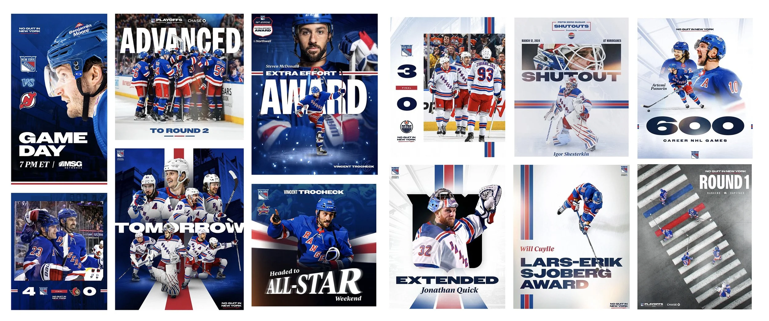
The Rangers design system :is defined by two modes that reflect the dualism of New York City and its hockey team: A dark mode for excitement, intensity and urgency. A light mode for elegance and a sense of premium. Unified by the type system, textures, and complimentary heritage elements, like the jersey piping. the campaign offers the consistency required for a strong sense of brand and the flexibility and variety to yield thousands of compelling assets in the course of a season.
Social
Digital/Email/OOH
Arena Graphics
For game presentation motion graphics at The Garden, it’s all about energy. That’s where the campaign is at its most fun and caffeinated.

